Thursday, 13 March 2014

Bait and Switch at the Italian Cultural Centre

I have to review a show that I was so, so SO excited to see at the Italian Cultural Centre here in Vancouver. Unfortunately I have to give it a no-so-positive review. I rate this about 1 or 2 out of 5 stars.

First of all, the very promising title is "The Bookbinder's Art", leading me to believe that this show was, you know, about bookbinding. As in featuring books, or bookbinding equipment, or something along those lines.

See The False Promises HERE

I also read the following review that reinforced my high expectations:

You make it sound SO GOOD, Shane

However, what was in store was not what I expected. The content of the show was literally 5 books. FIVE, goddammit!

Two of which were Japanese stab bind, AKA my most hated bind. My bind nemesis, if you will.
The work was primarily handmade and hand marbled papers, which I must say were very well done and exquisitely beautiful. If the show had been titled "The Paper Marbler's Art" this thing would be getting a 5 out of 5 stars review. The artist who made these papers is Candace Thayer-Coe, a Vancouver based paper guru. Candace earned my respect for her technical skills in papermaking (learned in the Philippines using local plant fibres) as well as two styles of paper marbling.

Learn More About Candace HERE

One way that Candace gets her marble-on is by using the Japanese technique of Suminagashi, which she explains as follows in her show didactic:

"The earliest form of marbling is Japanese Suminagashi. Suminagashi literally means ink floating. According to folklore, Suminagashi on paper was discovered in 1151 near the end of the Heian Era. This was a period when Japan was emerging from the influence of China and developing a national character of its own. The law restricted Suminagashi paper to the royal household for Tanka poetry and other documents for over four hundred years. Tradition identifies three sources from nature for the themes which early Suminagashi artists sought to represent in their work: the movement of clouds in the sky, the flowing motion of wind-blown white cloth and slowly running streams coursing through fields. Suminagashi encourages cooperation with the elements of the medium. The artist is but one of many natural forces determining the final marbled piece. Suminagashi is created by laying Boku-undo inks, made in Japan exclusively for Suminagashi, on tap water in a vat with pointed oriental brushes. Designs are motivated by gently blowing or fanning the ink on the water. Rice paper or handmade paper is carefully laid on the surface of the water capturing the image on the paper."

Here is some suminagashi in action:


Candace also makes a huge variety of Turkish marbled papers, in the tradition of Ebru. 
In Turkish, Ebru apparently means 'cloud', leading Candace to name her own business "Cloud Art". 
Ebru is awesome. Check it out: 


Ebru is also the source of the kind of marbled papers that are usually used as endpapers in many old books, particularly fine Italian and French binds. The technique also uses many tools to create the patterns that you may find familiar. 
The next video shows Paper Marbler Curtis Finley of Pacific, Missouri (USA) working on his craft. 


For more extensive info on Suminagashi, Ebru or other paper marbling, get Googling. YouTube is always a treasure trove of videos on every subject, so that is a good place to start. 

In cone-clusion, paper marbling is pretty cool, but it is not "The Bookbinder's Art". Maybe you can title your exhibitions in  a more accurate way in the future, Italian Cultural Centre. It would greatly increase my positivity in reviewing your shows. 

PS: Where did I get the term "in cone-clusion"? Right here. At 13:50 to be exact. 


Well that is all for now, hope you enjoy this rant. Please note I am trying to tone down the smut talk before my blog's tag line becomes "Laura Carey Books: Sexual Innuendos, All The Time". 

Until next time, 
Laura 


Tuesday, 11 March 2014

Master Binder is Possibly the Best Job Title in the World

Hey Vancouverites,
Did you know we have a Master Binder in our midst? I was only aware of Rasmussen Bindery in
North Van until recently.

Apparently there is a true Master Binder located right here. Richard Smart is a 3rd generation Master Binder and he is on a mission to make you insanely jealous of his work.

Prepare to see some high quality book smut.

FOR YOUR VIEWING PLEASURE

Enjoy!
Laura

Sunday, 9 March 2014

What The Hell Does That Word Mean?

As I try to learn more about bookbinding I often come across terms that I do not understand.
I have found the following resource very helpful -  an extensive list of bookbinding terminology.

RIGHT HERE

Till next time!
Kerfs,
Laura

Tuesday, 4 March 2014

Listen Up, Latvia...

I just want you to know that I know you are reading this. I thank you very much!
It turns out that Latvians (or one very persistent Latvian) make up my #3 source of readers.
In other news,  Riga is mother lovin' beautiful. See?


I hope to keep seeing you here.
xo,
Laura

Thursday, 17 January 2013

A Tall Glass of Hell Yeah

 Dear human or bot reading this,

I apologize for the lengthy absence. I am apparently falling into the habit of neglecting my blog. Like a sweet garden, this blog needs love and attention. I am here to water and love up the blog.On that note, here are some loverly books. 

These babies are meeting with your eyeballs courtesy of the Designer Bookbinders International Competition (2009).  The theme here is water. How apt for this occasion.


Bookbinder: George Kirkpatrick. Photo Courtesy of Bodleian Library.
Bookbinder: Yukiko Uchida. Photo Courtesy of Bodleian Library.

Bookbinder: Alain Taral. Photo Courtesy of Bodleian Library.

Bookbinder: Jenni Grey. Photo Courtesy of Bodleian Library.


Click Here For All The Sweet Deets.

Until next time,

xo
Laura

When you are out of paper...

...just find an abandoned house and write on the walls.

Sunday, 25 November 2012

Major Thanks, Major Tom

Thank you so much to all the lovely people who came to visit me at the Roundhouse show this weekend. Such a pleasure!

Also, I think I was blushing for the past two days as you all have been so extraordinarily kind and complimentary! I really am so so so grateful.

Here are some book shots as thanks. All of these books are made by hand by yours truly.

Leather and Japanese Chiyogami paper and real endbands:


Detail of the book on the far left:


Leather and brass findings (hardware) with latch closure:


Inlayed leather hardcover :


Scale shot of inlayed leather hardcover: 


PS The Roundhouse has the BEST STAFF EVER. You know I am talking to you, CC.


Sweet bibliophilic dreams,
xo
Laura


Saturday, 24 November 2012

Today Today Today! Alt Title: My Brain is a TV

Roundhouse! Roundhouse! Party Time! Excellent! Woo woo woo woo!


This post is fully not approved by Wayne and Garth. As I mentioned to someone the other day, this movie is on an eternal loop in my subconscious due to the fact that I watched the hell out of it from age 10-13. YES.

Back to the point, which is this:


Today and tomorrow at 181 Roundhouse Mews in Yaletown Vancouver, I will be waiting for you to come and fondle my books. How often do you get an invitation like that? Even if you have absolutely no intention of buying anything, please come for a visit. After all it is a SHOW and sale, so I want to do some major show and tell. It is kind of a hard gig to spend so much time making things in a vacuum - it is so cool when my books see the light of day and get to interact with human beings other than myself. 


This book wants to be loved by you. Just you, and nobody else but you.


Here is a cool view of another of the skeleton series books - I like how the book 'spine' is aligned with the anatomical vertebral column / 'spine'. Osteology nerds unite!

I hope to see you in person at Roundhouse! Come and give me a high five, you will not regret it. I have been told I am a world-class high fiver. See for yourself and be the judge.

Deets:
Roundhouse Urban Artisan's JURIED craft fair (that means that every person who glues google eyes to rocks is not going to be vending here. Quality, people!)
181 Roundhouse Mews. Yaletown. Vancouver
$1 Admission buys you sweet access to handmade love and a ticket to win a fresh pile of handmade goodness donated by artisans.
Hours are 10-5 both days

COME ON DOWN!


Oops I seem to be missing the best part: 


That is more like it. RIP, Bob. 


This is also acceptable.


Extra credit: My Dad is convinced we are related to Drew Carey based on the following details:

1. Our last name is also Carey.
2. We have family roots in Ohio (Cleveland Rocks!)
3.We share the same body type.
4. Dad wishes he could dance like Drew Carey.

When reading this post, please note that it is 7:30 am and I have been sleep deprived all week getting ready for this show. The filter is off like gloves in a hockey fight. Consider yourself JERSEYED.


xo
Laura


Monday, 19 November 2012

Show and Sale this Weekend!

Hi Friends,

Sorry I have been totally AWOL. I promise that it is for the greater good.
I recently was offered a full-time job that I could not pass up. With a long commute every day and books to make after work, I have not prioritized my time as well as I could have.

However, if you are in the Vancouver area you should come visit me at the Roundhouse Urban Artisan's show and sale this weekend. Come see what I have been up to!


Location:
Roundhouse Community Centre
181 Roundhouse Mews
Vancouver, BC V6Z 2W3
Canada


I hope to see you there! 

Friday, 26 October 2012

Things I Miss From Days of Yore

Remember using card catalogues at the library? I cannot say that I miss that. I remember going to school with a girl who took extreme pleasure in messing up the order of the cards in our little library. I imagine she was the only kid who was ever banned from her elementary school library.
Looking back she was some kind of proto-anarchist who was probably trying to take down "the man". Or "the woman", as was actually the case. The thing is that our elementary school librarian was one of the meanest people I have ever met. I will just call her Mrs. V. She was a real pill. Nonetheless, my love of books persevered.

What I DO miss about libraries is the old due date cards. I am a nerd for ephemera, especially when it contains the handwriting of people I do not know. So I was very stoked to find this!

Property of the Miskatonic University Library Orne Special Collections
It got me thinking about how to incorporate this into my own home library. I have been bad with lending books and then losing track of them over the years. I want to stop that from happening again, and the solution hit me like a ton of books. (As I prefer books to bricks).

Why not use library sign-out / due date cards in my own books? Turns out they are not hard to find online. Bonus: They are totally cheap. Or even free!

You can use this free template from the lovely folks at Love vs. Design. It seems to have a little owl image embedded, but it seems that all the cool kids on Etsy are loosing their shit about owls these days. Impress your friends!
RIGHT HERE

Well what about those little envelopes? How do you get a hold of those? Look no further than Mel Stampz's blog where she provides the templates for OVER 100 KINDS OF ENVELOPES. FREE. Yeah, that's right. FREE.
RIGHT HERE

Have fun!
xo
Laura

Thursday, 18 October 2012

The Internet is Cool. Bonus Exclamation Point Madness!


As I am a bit of a technophobe and quite late to the blogging game, I find myself continuously amazed by the fact that people all over the world can read this. 

Thank you to all my fellow Canadians! You are my main source of readership. Yay!

Hello and thank you to all you folks in the United States, Russia, Germany, Malysia, Netherlands, Australia, France, Brazil and Denmark who are also reading this! Amazing. 

Book lovers unite! 

Here are some nice hot shots of books as my token of appreciation for you. 


xo 

Laura 

Wednesday, 17 October 2012

False and True Medieval Bindings

Are you among the many who love the look of raised bands on book spines? This is usually a feature of Medieval books, although the technique is still used in contemporary bookbinding.

There are multiple ways to achieve this look.
The traditional method is called sewing on raised cords (or one of the many variations of that name, like pack-sewn bindings or double-pack when there are two cords creating each raised area on the spine. The photos below are of double-pack as there two cords side by side at each station that are sewn together.


When you look close up you can see something surprising - I had always assumed that with double-pack stitching it was necessary to loop around the two cords in a figure 8 to hold them securely. It appears that it is possible to bind this way by using a straight loop that encompasses both cords.


The point is, how the heck do you do that? This is one of the times when big league tools are handy. Particularly a sewing frame. This is a frame that allows you to stretch and hold the cords taught while adding and sewing the book sections.

The following 4 videos are in Italian (which I do not speak), but you can easily get the gist of the information. This is why I love well photographed or well-shot videos of masters at work - the craft transcends language.

First we fold and tear the paper into signatures. Then we set up the sewing frame using 'keys' that hold the string (cords) into place. Then add the signatures one at a time and start assembling the book. Note that this bookbinder is not using particularly heavy cord, and that a more pronounced banded profile can be achieved with thicker cord secured in the sewing frame.


Are you still there? Okay let's wrap this up and get on to finishing. 


Okay, now what? These steps leave you with a naked bookstack or textblock. How do you finish the binding? Beware, this uploader thought you may also like Thievery Corporation as much as he does. Prepare to hear his music in the background. 


In terms of sewing the cords, another variation is to saw deeper v-shaped channels into the bookspine, and lay the cords into the little troughs (also called kerfs, 'cause arts love synonyms). This creates a flat (or flatter- more like  a 1/4 round) profile on the spine. This allows for a very strong bind that will likely outlast the leather binding. As is the case with this sweet book below. Never look down your nose at a ruined binding, as this is one of the most valuable sources of binding information. How often do you get to see a great artwork with the technical steps exposed? Rarely. 


Sorry this next shot is mega blurry. I want to show you how different the profile is on this baby. Smooth!


So what about this false binding thing? It is a bit of a misnomer as the book really is bound, but does not actually need to be sewn on to cords. The raised bands are created on a separate spine piece and the book is assembled in more of a case bind style. 


For some reason I am not able to show this video on my blog. 

Have fun! 
xo
Laura 

Wednesday, 10 October 2012

Codex Gigas

Are you familiar with the Codex Gigas? It is the world's largest Medieval manuscript. This is one amazing text and an even more unbelievable bind. Not to mention the element of mystery and possible deals with the Devil involved. Curious? Here is a view of the cover.

Image property of Stockholm National Library

Looking good so far, am I right? Well it gets better. In this case there is so, so much more to love. 
For one thing, it is insanely gigantic. Remember that this is a Medieval manuscript made by hand. Debatably by a single human being.
Image property of Stockholm National Library
Are you salivating for more info? It is actually possible for one person to have created this book? Would you like to watch a sensationalized and slightly trashy documentary on the subject? This is still a very informative and exciting piece of drama-cumentary film.  You are in luck.

WATCH THE DOCUMENTARY HERE.

Curiouser and curiouser?

HERE IS THE WORLD DIGITAL LIBRARY LINK.

This is where you can browse through the manuscript page by page in exquisitely detailed photographs.
Enjoy!

xo
Laura

Monday, 8 October 2012

Medieval Bookbinding with Atelier Pigmenta Peregrinae


Today while doing my near-daily round of YouTube searching for bookbinding videos that will reveal new tidbits, I came across this gem. Brought to us by Atelier Pigmenta Peregrina (video remains their property).

Are you a fan of Medieval binding? This is a nice cross-section of the process. Bonus footage of textblocks in Medieval style. I know I really tend to focus on the structural elements of books, but I do have an appreciation for the guts. I actually gained a new appreciation of book contents this past weekend during an amazing chance encounter that I will tell you all about shortly. In the meantime enjoy this amazing work! 


Want to see more?  YOU CAN FIND THE PIGMENTA PEREGRINAE BLOG HERE.
xo
Laura


Friday, 5 October 2012

WORD ON THE STREET FESTIVAL - Alison Woodward

While at the Word on the Street Festival last weekend I had the extreme pleasure of having my mind blown by Alison Woodward. She is an amazing young illustrator extraordinaire who was kicking ass and taking names all over the place in the Zines and Comics room. Actually Alison is a very polite person who was perfectly professional. It was her work that was blowing it up.


WATCH THIS VIDEO. SERIOUSLY. DO IT NOW.

And guess what? There just might be a collaboration between her illustrations and my books coming in the future. If it happens I will not be able to shut up about it. You will be the first to know.

Want to see more of her awesome work? CHECK OUT HER BLOG.

I have a new art crush! Do you?
xo
Laura                                                            

WORD ON THE STREET FESTIVAL - BC Canadian Bookbinders and Book Artist Guild (CBBAG) Demo review #2 - Letterpress with CHARLES MAYRS

Back at the Word on the Street event I had the pleasure of meeting the artist Charles Mayrs, who is a writer, illustrator and photographer whose books are letterpress printed. 

While it would not be possible to actually bring the machinery for letterpress and demonstrate the process, there was a nice variety work showing the results. Mayrs' work ranges from text to imagery and even maps. Viewers were encouraged to ask questions about the process and actually handle the work! This is an awesome and rare opportunity as these books are housed in the archives or rare book sections of libraries and require special permission for handling. Also they cost about $750-$1200 bucks a pop and are created in extremely limited editions. 

Here are a couple of good videos from YouTube. I do not own the rights to any of these videos and they remain the property of the individual artists. 

This first one is really informative about the whole process from making type to actually printing. However I do find the narration ill-fitting and overly intense. 


This next one shows more about how to set the paper in place and create a guide for accurate alignment. I am surprised how fast the paper gets changed out and replaced with a new one. 


One last video showing a much more heavily inked plate. 


Now that we have seen some of the process, take a look at Charles' work.

In this first photo we see a mix of text and an image, with the page printed in black, red and yellow. As we can see from the videos there is only one color printed at a time, so this page is the sum of three different runs through the press. At first glance I totally assumed that the black would have been the first color printed. It looks to me like the black would be a great way to create a guideline for the other colors. It turns out that it was actually printed in red first, then yellow, then black last. Charles pointed out that the large red letter S as well as the red hair were printed at the same time.

Imagine these pages coming out of the press between stages. The first one would be only the large letter I and the negative space in the face and neck, separated by white spaces. Next the three yellow details in the nose and shoulders. Finally the black text and all the black lines that unify the image. What a magical feeling it must be to see the work come to life in this way.

To make things more complex, this next page boasts four colors.


In another publication Mayrs includes his stunning landscape photography. The photos are beautifully printed in luminous color and add to the feeling that the books are something special.


One book even contained a map pertinent to the story. The black details are letterpress printed. Afterwards Charles added tea stains and burnt edges to add to the aged and used feel of the piece. I love to mix up your media and do a lot of finishing after the first stage is complete. I always admire the various stages of detailing in artwork.


In other volumes more complex imagery starts to appear.


I was told that these images are a combination of black letterpress details and hand-colored finishing using Prismacolor pencil crayons. That means that each edition is really one of a kind!


And then things just get crazy. I love these amazing pieces! Again we are looking at a combo of black letterpress and hand applied pencil crayon. These are not prints, each piece is a unique iteration of the work.


And for bonus points Charles has a beautiful, simple  business card that I totally love. Naturally, the business card is letterpress printed.


I have to say the portrait of Charles it is pretty true to life. Wouldn't you say? Here he is in the flesh.
I am not sure whether the striped shirt is a coincidence or some kind of trademark. I guess the goatee is a new addition.


Hope you have enjoyed this little ditty about letterpress. Google some images or search YouTube to learn more if you are feeling inclined. You may get hooked.

xo
Laura

Thursday, 4 October 2012

Roundhouse Urban Artisan's Fair - Featuring Yours Truly! November 24th and 25th, Yaletown Vancouver.

Hey, check me out on the Roundhouse Facebook page for this year's Urban Artisan's Fair!

There's three of my books right there at the bottom! Awesome!

I am so totally stoked as this is my first show in Vancouver since moving here in August. What are you doing on November 24th and 25th? I suggest you come for a visit!

Check out the Roundhouse Facebook page for more info. Hope to see you there!
WANNA GO TO ROUNDHOUSE'S FACEBOOK PAGE RIGHT NOW?

xo
Laura

Monday, 1 October 2012

WORD ON THE STREET FESTIVAL - BC Canadian Bookbinders and Book Artist Guild (CBBAG) Demo review #1 - Tunnel Books


While the Word on the Street Festival is not new to Vancouver, it is new to me as I am a recent transplant. Perhaps you noticed I was very excited about this. The good news is that the festival had a huge range of authors, book artists, comic artists and poets, all showing or reading their work. 

The bad news is that several of the CBBAG members who were on the original roster were not able to make it. I was truly heartbroken that the Fine French bookbinding and the fasteners & enclosures demos were cancelled. 

The remaining demos I attended were tunnel books, letterpress and coptic bookbinding. 
Let us start with tunnel books, shall we? 

Here are the samples that were waiting at the CBBAG table. I was surprised to see that this demo was geared to kids, but why not include them in a workshop? Yes I was the lone adult without a kid with me but I still enjoyed the process. 

Design Property of Edward H. Hutchins. Samples property of Gina Page. Used with permission. 
As the demo was designed to include kids, we were provided with pre-formed blanks and guidebooks.
Below is a photo of the guidebook, with lettered sections indicating how to overlap properly.

Design property of Edward H. Hutchins
Then we moved on to a pre-cut and pre-folded blank that had eight folded sections. Four of the sections had pre-cut windows. The other four sections were still solid for stamping or drawing designs to be cut out at a later stage. These solid and cut-out sections alternate to the end of the book.
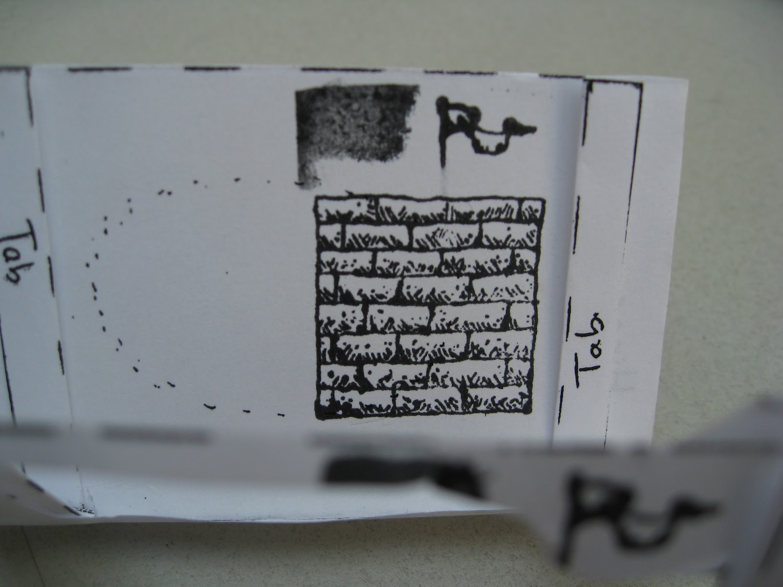
Also notice that along the edges are tabs that are labelled and folded back. These tabs will be attached in a later step.


We were provided with stamp pads and markers for creating the images. 


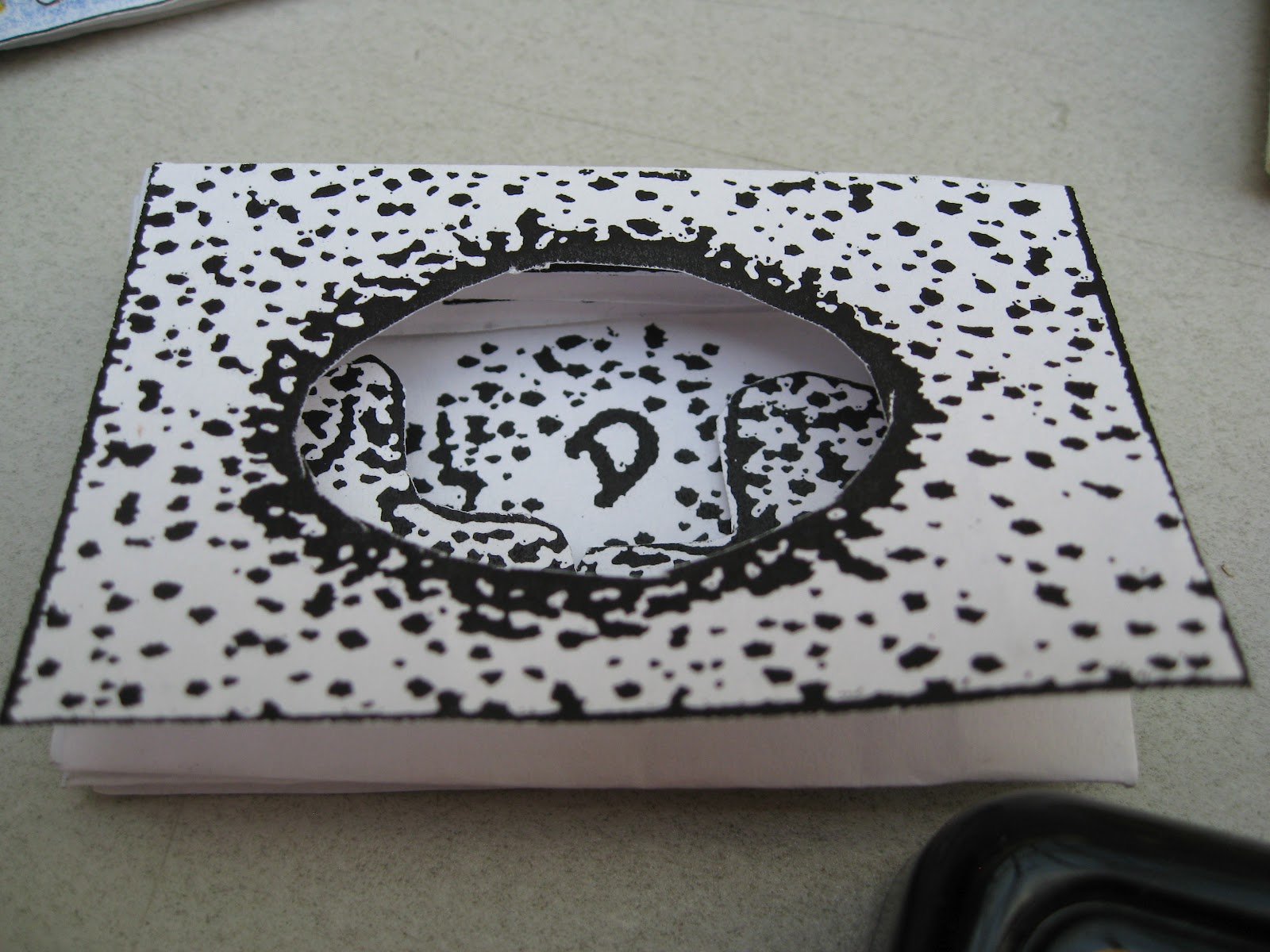
For the first page, I selected a stamp I liked and applied it. I then cut out inside the image to create the first part of the tunnel. Notice that the second page is already cut as there will be no images added.


Now I placed my stamp in side the cutouts on the first and second pages, to stamp a design onto the third page.


Now cut around the design on the third page just as you did with the first page.


Please remember I work with my hands and I am too broke for a manicure. No comments about my hangnails will be considered. 

Stamp on to the fifth page (as the fourth page is already cut out and will not have images applied)


Cut around the image(s) on the fifth page.


I thought this looked cluttered so I took out the image on the right as I finished cutting.


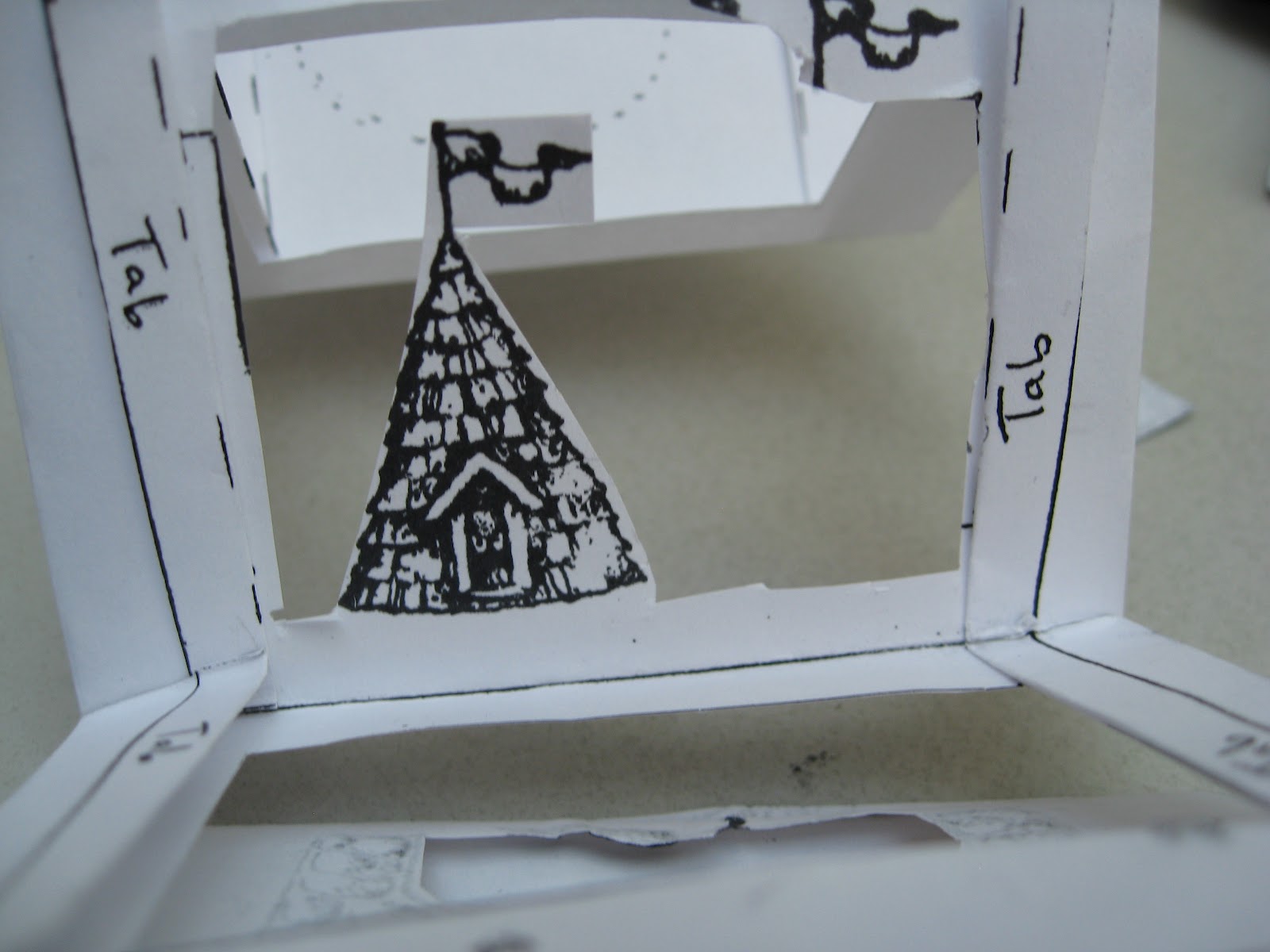
Peek through the first four pages to see how your images are lining up.

Now stamp one more image on the seventh page. This will be the final visible page in the book, with the eighth page being folded down to become the back cover.


You do NOT need to cut out the image you draw or stamp onto the seventh page.


Now we can start to assemble the book. Taking a glue stick, apply glue to the tab section on the third page. 


Add glue to the tabs on both the left and right sides.


Repeat with the tabs from the second page.


Be sure to add glue to both the left and right hand tabs.


Now carefully fold the second and third pages together so that the tabs touch. Press firmly to set the join. 

Be sure to take the time to make the edges line up, as this cannot be changed later when the glue is dry.


Now glue the back side of the seventh and eighth pages together. This will make the back cover.


Repeat the last step for pages one and two to secure the first image to the rest of the bookstack. Keep in mind that there is no front cover. The first image is visible when the book is finished.


Credit is due to the esteemed American bookbinder Edward H. Hutchins who created and owns the rights to this particular design template.


Want to make it yourself? 


Please note that all photos were taken by me (Laura Carey) and I own the images of the book being created. However, I do NOT own this design. Again, that is the property of Edward H. Hutchins.