Showing posts with label BC CBBAG. Show all posts

Friday, 5 October 2012

WORD ON THE STREET FESTIVAL - BC Canadian Bookbinders and Book Artist Guild (CBBAG) Demo review #2 - Letterpress with CHARLES MAYRS

Back at the Word on the Street event I had the pleasure of meeting the artist Charles Mayrs, who is a writer, illustrator and photographer whose books are letterpress printed. 

While it would not be possible to actually bring the machinery for letterpress and demonstrate the process, there was a nice variety work showing the results. Mayrs' work ranges from text to imagery and even maps. Viewers were encouraged to ask questions about the process and actually handle the work! This is an awesome and rare opportunity as these books are housed in the archives or rare book sections of libraries and require special permission for handling. Also they cost about $750-$1200 bucks a pop and are created in extremely limited editions. 

Here are a couple of good videos from YouTube. I do not own the rights to any of these videos and they remain the property of the individual artists. 

This first one is really informative about the whole process from making type to actually printing. However I do find the narration ill-fitting and overly intense. 


This next one shows more about how to set the paper in place and create a guide for accurate alignment. I am surprised how fast the paper gets changed out and replaced with a new one. 


One last video showing a much more heavily inked plate. 


Now that we have seen some of the process, take a look at Charles' work.

In this first photo we see a mix of text and an image, with the page printed in black, red and yellow. As we can see from the videos there is only one color printed at a time, so this page is the sum of three different runs through the press. At first glance I totally assumed that the black would have been the first color printed. It looks to me like the black would be a great way to create a guideline for the other colors. It turns out that it was actually printed in red first, then yellow, then black last. Charles pointed out that the large red letter S as well as the red hair were printed at the same time.

Imagine these pages coming out of the press between stages. The first one would be only the large letter I and the negative space in the face and neck, separated by white spaces. Next the three yellow details in the nose and shoulders. Finally the black text and all the black lines that unify the image. What a magical feeling it must be to see the work come to life in this way.

To make things more complex, this next page boasts four colors.


In another publication Mayrs includes his stunning landscape photography. The photos are beautifully printed in luminous color and add to the feeling that the books are something special.


One book even contained a map pertinent to the story. The black details are letterpress printed. Afterwards Charles added tea stains and burnt edges to add to the aged and used feel of the piece. I love to mix up your media and do a lot of finishing after the first stage is complete. I always admire the various stages of detailing in artwork.


In other volumes more complex imagery starts to appear.


I was told that these images are a combination of black letterpress details and hand-colored finishing using Prismacolor pencil crayons. That means that each edition is really one of a kind!


And then things just get crazy. I love these amazing pieces! Again we are looking at a combo of black letterpress and hand applied pencil crayon. These are not prints, each piece is a unique iteration of the work.


And for bonus points Charles has a beautiful, simple  business card that I totally love. Naturally, the business card is letterpress printed.


I have to say the portrait of Charles it is pretty true to life. Wouldn't you say? Here he is in the flesh.
I am not sure whether the striped shirt is a coincidence or some kind of trademark. I guess the goatee is a new addition.


Hope you have enjoyed this little ditty about letterpress. Google some images or search YouTube to learn more if you are feeling inclined. You may get hooked.

xo
Laura

Monday, 1 October 2012

WORD ON THE STREET FESTIVAL - BC Canadian Bookbinders and Book Artist Guild (CBBAG) Demo review #1 - Tunnel Books


While the Word on the Street Festival is not new to Vancouver, it is new to me as I am a recent transplant. Perhaps you noticed I was very excited about this. The good news is that the festival had a huge range of authors, book artists, comic artists and poets, all showing or reading their work. 

The bad news is that several of the CBBAG members who were on the original roster were not able to make it. I was truly heartbroken that the Fine French bookbinding and the fasteners & enclosures demos were cancelled. 

The remaining demos I attended were tunnel books, letterpress and coptic bookbinding. 
Let us start with tunnel books, shall we? 

Here are the samples that were waiting at the CBBAG table. I was surprised to see that this demo was geared to kids, but why not include them in a workshop? Yes I was the lone adult without a kid with me but I still enjoyed the process. 

Design Property of Edward H. Hutchins. Samples property of Gina Page. Used with permission. 
As the demo was designed to include kids, we were provided with pre-formed blanks and guidebooks.
Below is a photo of the guidebook, with lettered sections indicating how to overlap properly.

Design property of Edward H. Hutchins
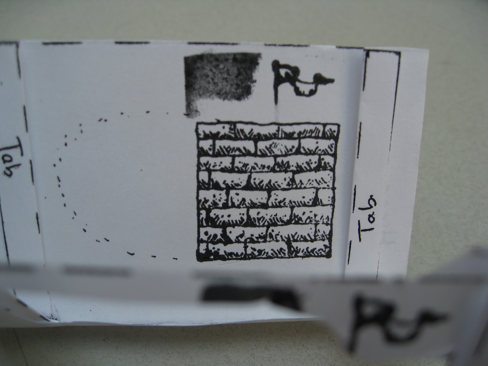
Then we moved on to a pre-cut and pre-folded blank that had eight folded sections. Four of the sections had pre-cut windows. The other four sections were still solid for stamping or drawing designs to be cut out at a later stage. These solid and cut-out sections alternate to the end of the book.
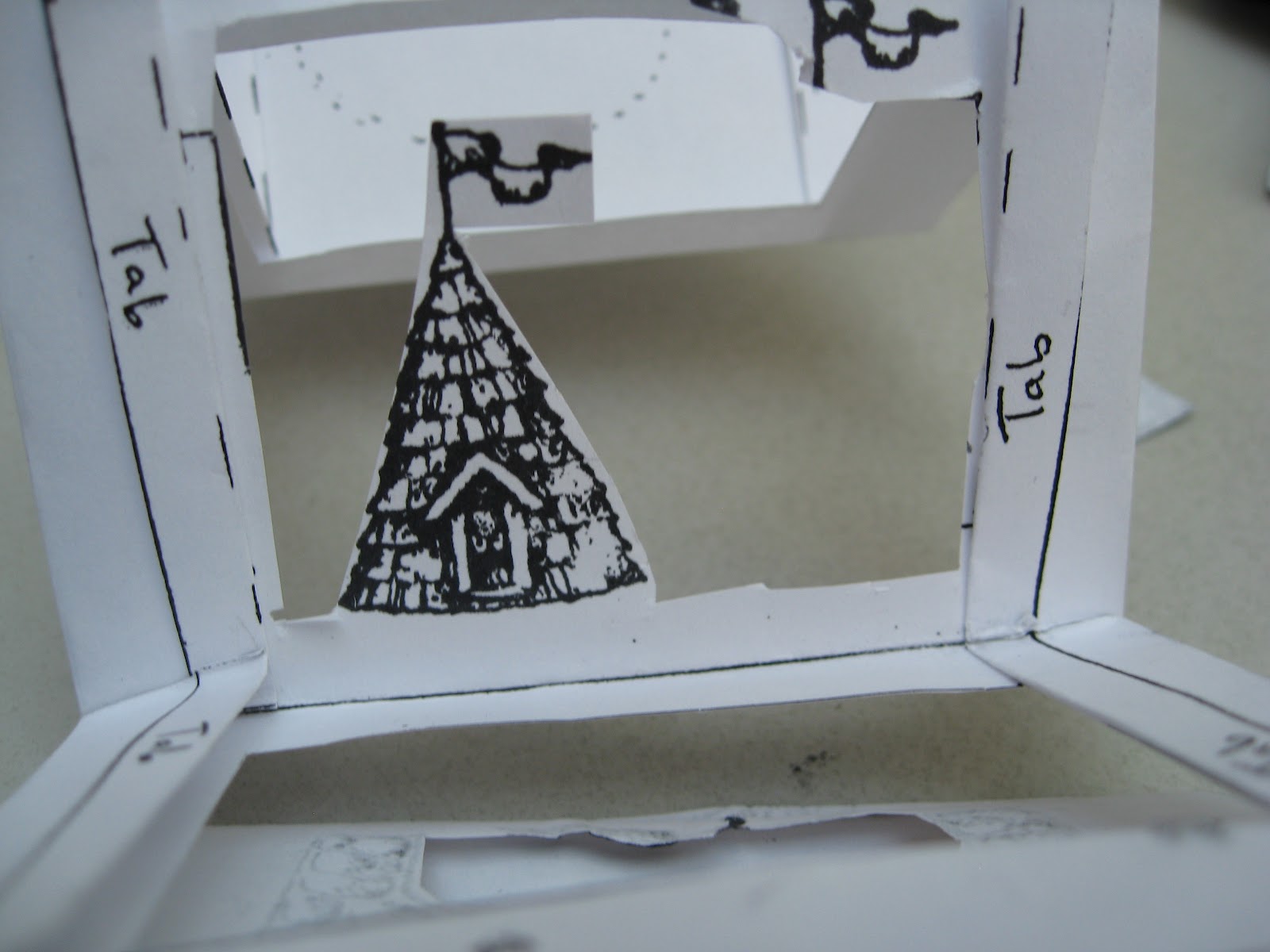
Also notice that along the edges are tabs that are labelled and folded back. These tabs will be attached in a later step.


We were provided with stamp pads and markers for creating the images. 


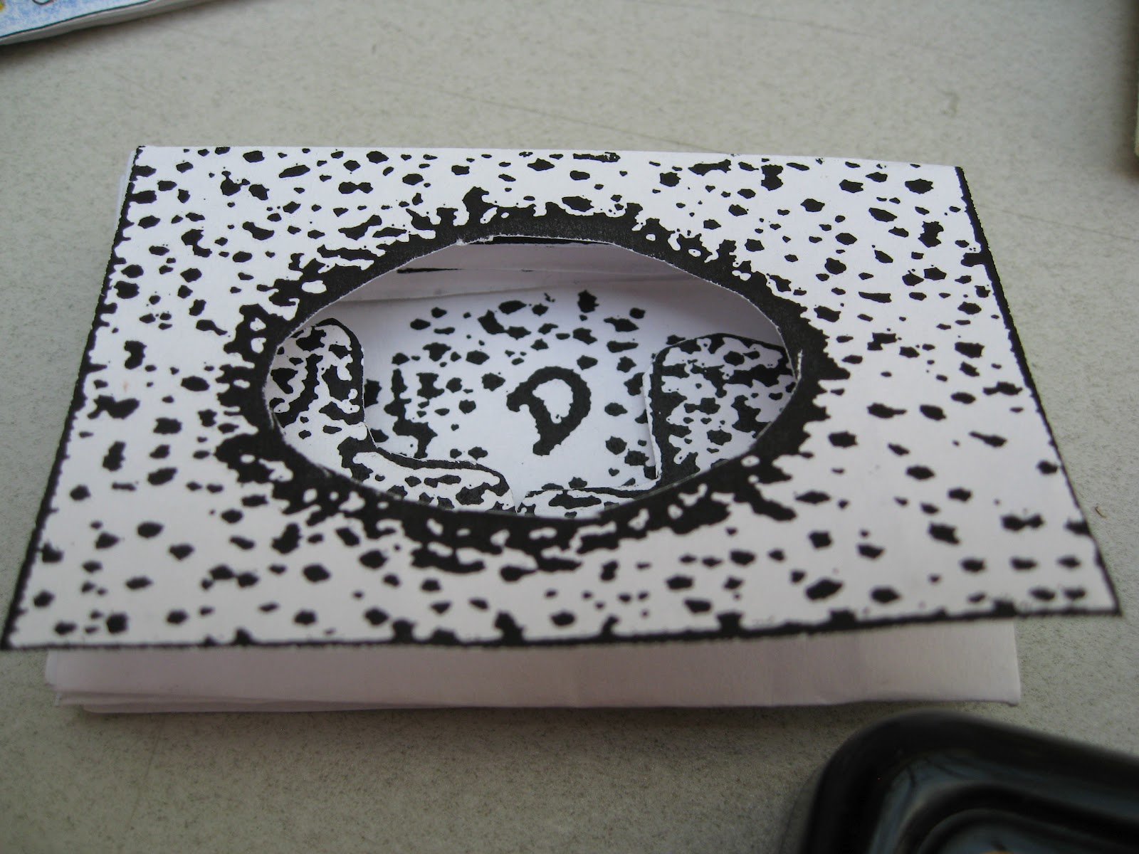
For the first page, I selected a stamp I liked and applied it. I then cut out inside the image to create the first part of the tunnel. Notice that the second page is already cut as there will be no images added.


Now I placed my stamp in side the cutouts on the first and second pages, to stamp a design onto the third page.


Now cut around the design on the third page just as you did with the first page.


Please remember I work with my hands and I am too broke for a manicure. No comments about my hangnails will be considered. 

Stamp on to the fifth page (as the fourth page is already cut out and will not have images applied)


Cut around the image(s) on the fifth page.


I thought this looked cluttered so I took out the image on the right as I finished cutting.


Peek through the first four pages to see how your images are lining up.

Now stamp one more image on the seventh page. This will be the final visible page in the book, with the eighth page being folded down to become the back cover.


You do NOT need to cut out the image you draw or stamp onto the seventh page.


Now we can start to assemble the book. Taking a glue stick, apply glue to the tab section on the third page. 


Add glue to the tabs on both the left and right sides.


Repeat with the tabs from the second page.


Be sure to add glue to both the left and right hand tabs.


Now carefully fold the second and third pages together so that the tabs touch. Press firmly to set the join. 

Be sure to take the time to make the edges line up, as this cannot be changed later when the glue is dry.


Now glue the back side of the seventh and eighth pages together. This will make the back cover.


Repeat the last step for pages one and two to secure the first image to the rest of the bookstack. Keep in mind that there is no front cover. The first image is visible when the book is finished.


Credit is due to the esteemed American bookbinder Edward H. Hutchins who created and owns the rights to this particular design template.


Want to make it yourself? 


Please note that all photos were taken by me (Laura Carey) and I own the images of the book being created. However, I do NOT own this design. Again, that is the property of Edward H. Hutchins. 

Sunday, 30 September 2012

Today is the Day! BC CBBAG Demo Time!

Okay I am so totally exceptionally excited today!
Here is why:

Add caption
For more info check out the CBBAG website: http://vanbookarts.wordpress.com/
If you are in the Vancouver area, I hope you drop by! 
I will be back tomorrow with reviews of the workshops 

Hope you have a great day! 
xo
Laura