Friday 26 October 2012

Things I Miss From Days of Yore

Remember using card catalogues at the library? I cannot say that I miss that. I remember going to school with a girl who took extreme pleasure in messing up the order of the cards in our little library. I imagine she was the only kid who was ever banned from her elementary school library.
Looking back she was some kind of proto-anarchist who was probably trying to take down "the man". Or "the woman", as was actually the case. The thing is that our elementary school librarian was one of the meanest people I have ever met. I will just call her Mrs. V. She was a real pill. Nonetheless, my love of books persevered.

What I DO miss about libraries is the old due date cards. I am a nerd for ephemera, especially when it contains the handwriting of people I do not know. So I was very stoked to find this!

Property of the Miskatonic University Library Orne Special Collections
It got me thinking about how to incorporate this into my own home library. I have been bad with lending books and then losing track of them over the years. I want to stop that from happening again, and the solution hit me like a ton of books. (As I prefer books to bricks).

Why not use library sign-out / due date cards in my own books? Turns out they are not hard to find online. Bonus: They are totally cheap. Or even free!

You can use this free template from the lovely folks at Love vs. Design. It seems to have a little owl image embedded, but it seems that all the cool kids on Etsy are loosing their shit about owls these days. Impress your friends!
RIGHT HERE

Well what about those little envelopes? How do you get a hold of those? Look no further than Mel Stampz's blog where she provides the templates for OVER 100 KINDS OF ENVELOPES. FREE. Yeah, that's right. FREE.
RIGHT HERE

Have fun!
xo
Laura

Thursday 18 October 2012

The Internet is Cool. Bonus Exclamation Point Madness!


As I am a bit of a technophobe and quite late to the blogging game, I find myself continuously amazed by the fact that people all over the world can read this. 

Thank you to all my fellow Canadians! You are my main source of readership. Yay!

Hello and thank you to all you folks in the United States, Russia, Germany, Malysia, Netherlands, Australia, France, Brazil and Denmark who are also reading this! Amazing. 

Book lovers unite! 

Here are some nice hot shots of books as my token of appreciation for you. 


xo 

Laura 

Wednesday 17 October 2012

False and True Medieval Bindings

Are you among the many who love the look of raised bands on book spines? This is usually a feature of Medieval books, although the technique is still used in contemporary bookbinding.

There are multiple ways to achieve this look.
The traditional method is called sewing on raised cords (or one of the many variations of that name, like pack-sewn bindings or double-pack when there are two cords creating each raised area on the spine. The photos below are of double-pack as there two cords side by side at each station that are sewn together.


When you look close up you can see something surprising - I had always assumed that with double-pack stitching it was necessary to loop around the two cords in a figure 8 to hold them securely. It appears that it is possible to bind this way by using a straight loop that encompasses both cords.


The point is, how the heck do you do that? This is one of the times when big league tools are handy. Particularly a sewing frame. This is a frame that allows you to stretch and hold the cords taught while adding and sewing the book sections.

The following 4 videos are in Italian (which I do not speak), but you can easily get the gist of the information. This is why I love well photographed or well-shot videos of masters at work - the craft transcends language.

First we fold and tear the paper into signatures. Then we set up the sewing frame using 'keys' that hold the string (cords) into place. Then add the signatures one at a time and start assembling the book. Note that this bookbinder is not using particularly heavy cord, and that a more pronounced banded profile can be achieved with thicker cord secured in the sewing frame.


Are you still there? Okay let's wrap this up and get on to finishing. 


Okay, now what? These steps leave you with a naked bookstack or textblock. How do you finish the binding? Beware, this uploader thought you may also like Thievery Corporation as much as he does. Prepare to hear his music in the background. 


In terms of sewing the cords, another variation is to saw deeper v-shaped channels into the bookspine, and lay the cords into the little troughs (also called kerfs, 'cause arts love synonyms). This creates a flat (or flatter- more like  a 1/4 round) profile on the spine. This allows for a very strong bind that will likely outlast the leather binding. As is the case with this sweet book below. Never look down your nose at a ruined binding, as this is one of the most valuable sources of binding information. How often do you get to see a great artwork with the technical steps exposed? Rarely. 


Sorry this next shot is mega blurry. I want to show you how different the profile is on this baby. Smooth!


So what about this false binding thing? It is a bit of a misnomer as the book really is bound, but does not actually need to be sewn on to cords. The raised bands are created on a separate spine piece and the book is assembled in more of a case bind style. 


For some reason I am not able to show this video on my blog. 

Have fun! 
xo
Laura 

Wednesday 10 October 2012

Codex Gigas

Are you familiar with the Codex Gigas? It is the world's largest Medieval manuscript. This is one amazing text and an even more unbelievable bind. Not to mention the element of mystery and possible deals with the Devil involved. Curious? Here is a view of the cover.

Image property of Stockholm National Library

Looking good so far, am I right? Well it gets better. In this case there is so, so much more to love. 
For one thing, it is insanely gigantic. Remember that this is a Medieval manuscript made by hand. Debatably by a single human being.
Image property of Stockholm National Library
Are you salivating for more info? It is actually possible for one person to have created this book? Would you like to watch a sensationalized and slightly trashy documentary on the subject? This is still a very informative and exciting piece of drama-cumentary film.  You are in luck.

WATCH THE DOCUMENTARY HERE.

Curiouser and curiouser?

HERE IS THE WORLD DIGITAL LIBRARY LINK.

This is where you can browse through the manuscript page by page in exquisitely detailed photographs.
Enjoy!

xo
Laura

Monday 8 October 2012

Medieval Bookbinding with Atelier Pigmenta Peregrinae


Today while doing my near-daily round of YouTube searching for bookbinding videos that will reveal new tidbits, I came across this gem. Brought to us by Atelier Pigmenta Peregrina (video remains their property).

Are you a fan of Medieval binding? This is a nice cross-section of the process. Bonus footage of textblocks in Medieval style. I know I really tend to focus on the structural elements of books, but I do have an appreciation for the guts. I actually gained a new appreciation of book contents this past weekend during an amazing chance encounter that I will tell you all about shortly. In the meantime enjoy this amazing work! 


Want to see more?  YOU CAN FIND THE PIGMENTA PEREGRINAE BLOG HERE.
xo
Laura


Friday 5 October 2012

WORD ON THE STREET FESTIVAL - Alison Woodward

While at the Word on the Street Festival last weekend I had the extreme pleasure of having my mind blown by Alison Woodward. She is an amazing young illustrator extraordinaire who was kicking ass and taking names all over the place in the Zines and Comics room. Actually Alison is a very polite person who was perfectly professional. It was her work that was blowing it up.


WATCH THIS VIDEO. SERIOUSLY. DO IT NOW.

And guess what? There just might be a collaboration between her illustrations and my books coming in the future. If it happens I will not be able to shut up about it. You will be the first to know.

Want to see more of her awesome work? CHECK OUT HER BLOG.

I have a new art crush! Do you?
xo
Laura                                                            

WORD ON THE STREET FESTIVAL - BC Canadian Bookbinders and Book Artist Guild (CBBAG) Demo review #2 - Letterpress with CHARLES MAYRS

Back at the Word on the Street event I had the pleasure of meeting the artist Charles Mayrs, who is a writer, illustrator and photographer whose books are letterpress printed. 

While it would not be possible to actually bring the machinery for letterpress and demonstrate the process, there was a nice variety work showing the results. Mayrs' work ranges from text to imagery and even maps. Viewers were encouraged to ask questions about the process and actually handle the work! This is an awesome and rare opportunity as these books are housed in the archives or rare book sections of libraries and require special permission for handling. Also they cost about $750-$1200 bucks a pop and are created in extremely limited editions. 

Here are a couple of good videos from YouTube. I do not own the rights to any of these videos and they remain the property of the individual artists. 

This first one is really informative about the whole process from making type to actually printing. However I do find the narration ill-fitting and overly intense. 


This next one shows more about how to set the paper in place and create a guide for accurate alignment. I am surprised how fast the paper gets changed out and replaced with a new one. 


One last video showing a much more heavily inked plate. 


Now that we have seen some of the process, take a look at Charles' work.

In this first photo we see a mix of text and an image, with the page printed in black, red and yellow. As we can see from the videos there is only one color printed at a time, so this page is the sum of three different runs through the press. At first glance I totally assumed that the black would have been the first color printed. It looks to me like the black would be a great way to create a guideline for the other colors. It turns out that it was actually printed in red first, then yellow, then black last. Charles pointed out that the large red letter S as well as the red hair were printed at the same time.

Imagine these pages coming out of the press between stages. The first one would be only the large letter I and the negative space in the face and neck, separated by white spaces. Next the three yellow details in the nose and shoulders. Finally the black text and all the black lines that unify the image. What a magical feeling it must be to see the work come to life in this way.

To make things more complex, this next page boasts four colors.


In another publication Mayrs includes his stunning landscape photography. The photos are beautifully printed in luminous color and add to the feeling that the books are something special.


One book even contained a map pertinent to the story. The black details are letterpress printed. Afterwards Charles added tea stains and burnt edges to add to the aged and used feel of the piece. I love to mix up your media and do a lot of finishing after the first stage is complete. I always admire the various stages of detailing in artwork.


In other volumes more complex imagery starts to appear.


I was told that these images are a combination of black letterpress details and hand-colored finishing using Prismacolor pencil crayons. That means that each edition is really one of a kind!


And then things just get crazy. I love these amazing pieces! Again we are looking at a combo of black letterpress and hand applied pencil crayon. These are not prints, each piece is a unique iteration of the work.


And for bonus points Charles has a beautiful, simple  business card that I totally love. Naturally, the business card is letterpress printed.


I have to say the portrait of Charles it is pretty true to life. Wouldn't you say? Here he is in the flesh.
I am not sure whether the striped shirt is a coincidence or some kind of trademark. I guess the goatee is a new addition.


Hope you have enjoyed this little ditty about letterpress. Google some images or search YouTube to learn more if you are feeling inclined. You may get hooked.

xo
Laura

Thursday 4 October 2012

Roundhouse Urban Artisan's Fair - Featuring Yours Truly! November 24th and 25th, Yaletown Vancouver.

Hey, check me out on the Roundhouse Facebook page for this year's Urban Artisan's Fair!

There's three of my books right there at the bottom! Awesome!

I am so totally stoked as this is my first show in Vancouver since moving here in August. What are you doing on November 24th and 25th? I suggest you come for a visit!

Check out the Roundhouse Facebook page for more info. Hope to see you there!
WANNA GO TO ROUNDHOUSE'S FACEBOOK PAGE RIGHT NOW?

xo
Laura

Monday 1 October 2012

WORD ON THE STREET FESTIVAL - BC Canadian Bookbinders and Book Artist Guild (CBBAG) Demo review #1 - Tunnel Books


While the Word on the Street Festival is not new to Vancouver, it is new to me as I am a recent transplant. Perhaps you noticed I was very excited about this. The good news is that the festival had a huge range of authors, book artists, comic artists and poets, all showing or reading their work. 

The bad news is that several of the CBBAG members who were on the original roster were not able to make it. I was truly heartbroken that the Fine French bookbinding and the fasteners & enclosures demos were cancelled. 

The remaining demos I attended were tunnel books, letterpress and coptic bookbinding. 
Let us start with tunnel books, shall we? 

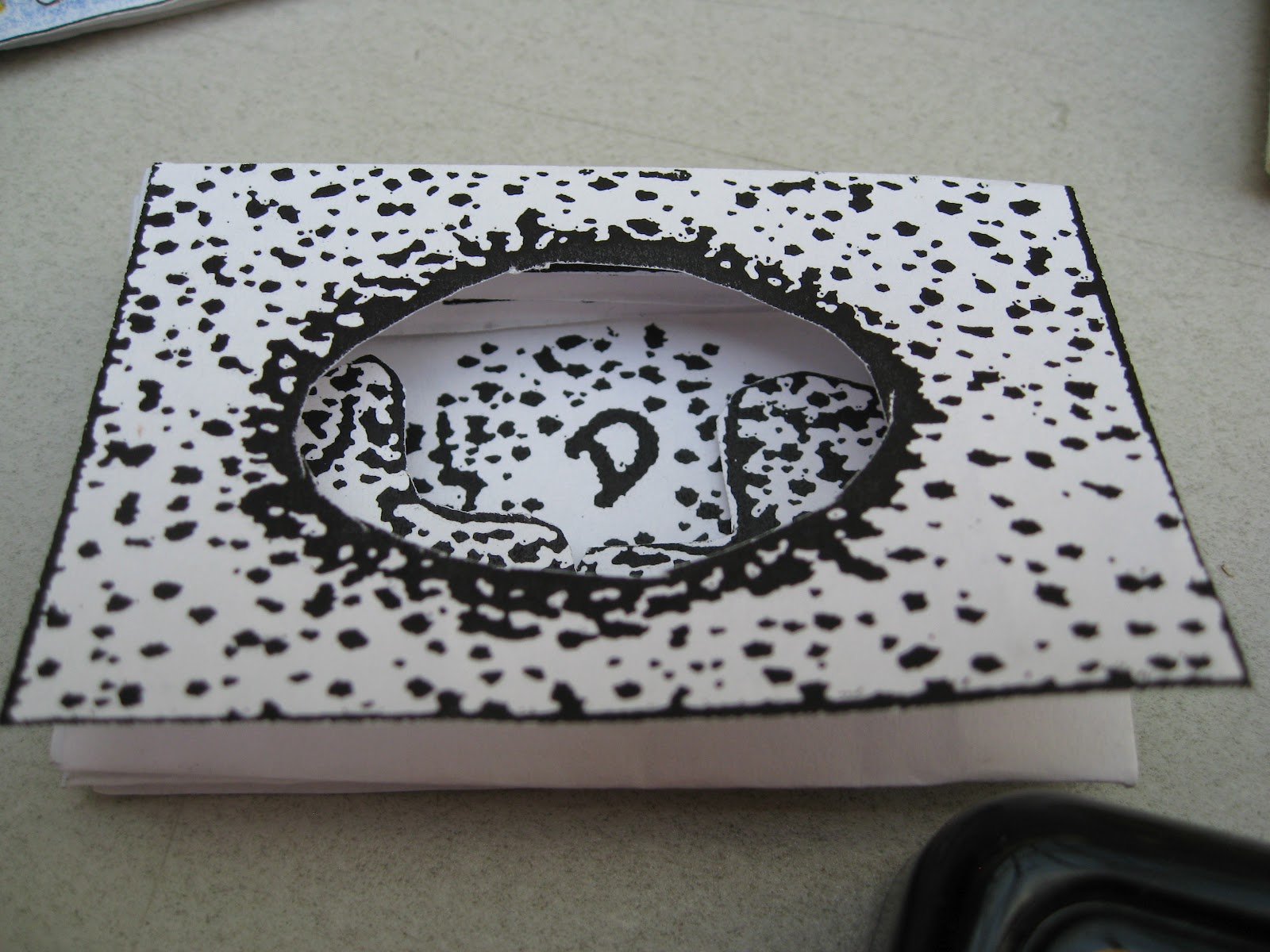
Here are the samples that were waiting at the CBBAG table. I was surprised to see that this demo was geared to kids, but why not include them in a workshop? Yes I was the lone adult without a kid with me but I still enjoyed the process. 

Design Property of Edward H. Hutchins. Samples property of Gina Page. Used with permission. 
As the demo was designed to include kids, we were provided with pre-formed blanks and guidebooks.
Below is a photo of the guidebook, with lettered sections indicating how to overlap properly.

Design property of Edward H. Hutchins
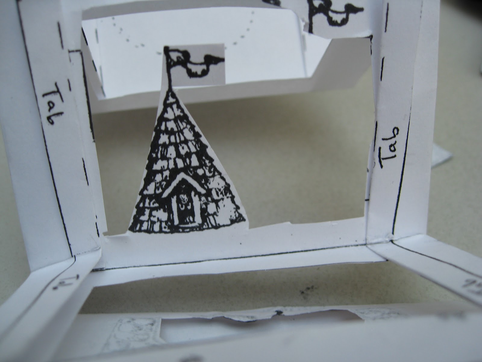
Then we moved on to a pre-cut and pre-folded blank that had eight folded sections. Four of the sections had pre-cut windows. The other four sections were still solid for stamping or drawing designs to be cut out at a later stage. These solid and cut-out sections alternate to the end of the book.
Also notice that along the edges are tabs that are labelled and folded back. These tabs will be attached in a later step.


We were provided with stamp pads and markers for creating the images. 


For the first page, I selected a stamp I liked and applied it. I then cut out inside the image to create the first part of the tunnel. Notice that the second page is already cut as there will be no images added.


Now I placed my stamp in side the cutouts on the first and second pages, to stamp a design onto the third page.


Now cut around the design on the third page just as you did with the first page.


Please remember I work with my hands and I am too broke for a manicure. No comments about my hangnails will be considered. 

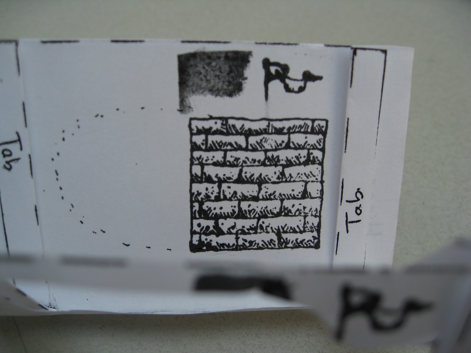
Stamp on to the fifth page (as the fourth page is already cut out and will not have images applied)


Cut around the image(s) on the fifth page.


I thought this looked cluttered so I took out the image on the right as I finished cutting.


Peek through the first four pages to see how your images are lining up.

Now stamp one more image on the seventh page. This will be the final visible page in the book, with the eighth page being folded down to become the back cover.


You do NOT need to cut out the image you draw or stamp onto the seventh page.


Now we can start to assemble the book. Taking a glue stick, apply glue to the tab section on the third page. 


Add glue to the tabs on both the left and right sides.


Repeat with the tabs from the second page.


Be sure to add glue to both the left and right hand tabs.


Now carefully fold the second and third pages together so that the tabs touch. Press firmly to set the join. 

Be sure to take the time to make the edges line up, as this cannot be changed later when the glue is dry.


Now glue the back side of the seventh and eighth pages together. This will make the back cover.


Repeat the last step for pages one and two to secure the first image to the rest of the bookstack. Keep in mind that there is no front cover. The first image is visible when the book is finished.


Credit is due to the esteemed American bookbinder Edward H. Hutchins who created and owns the rights to this particular design template.


Want to make it yourself? 


Please note that all photos were taken by me (Laura Carey) and I own the images of the book being created. However, I do NOT own this design. Again, that is the property of Edward H. Hutchins.